
Responsivize
2.0.0A simple and efficient application that is designed to help you test your websites\' responsiveness on mobile, laptop, and tablet
Responsivize is an Electron application that enables users to easily test their live websites and check these wepages' responsiveness from within a comfortable and sleek-looking interface.
The open-source community is growing rapidly, and, as a consequence, more and more tools and projects emerge daily. Responsivize is an open-source project which offers cross-platform applications that allow users to test the way their website designs performs on different screen sizes. For Windows, the app comes in two formats — with an installer and in the portable format.
Being an Electron application, it is expected that Responsivize has a sleek, good-looking GUI. Also, it is important to take into account that Electron applications run on 64-bit architectures only. Also, regarding the app's size (in the portable format), after unzipping the portable version, you end up with a pretty large file.
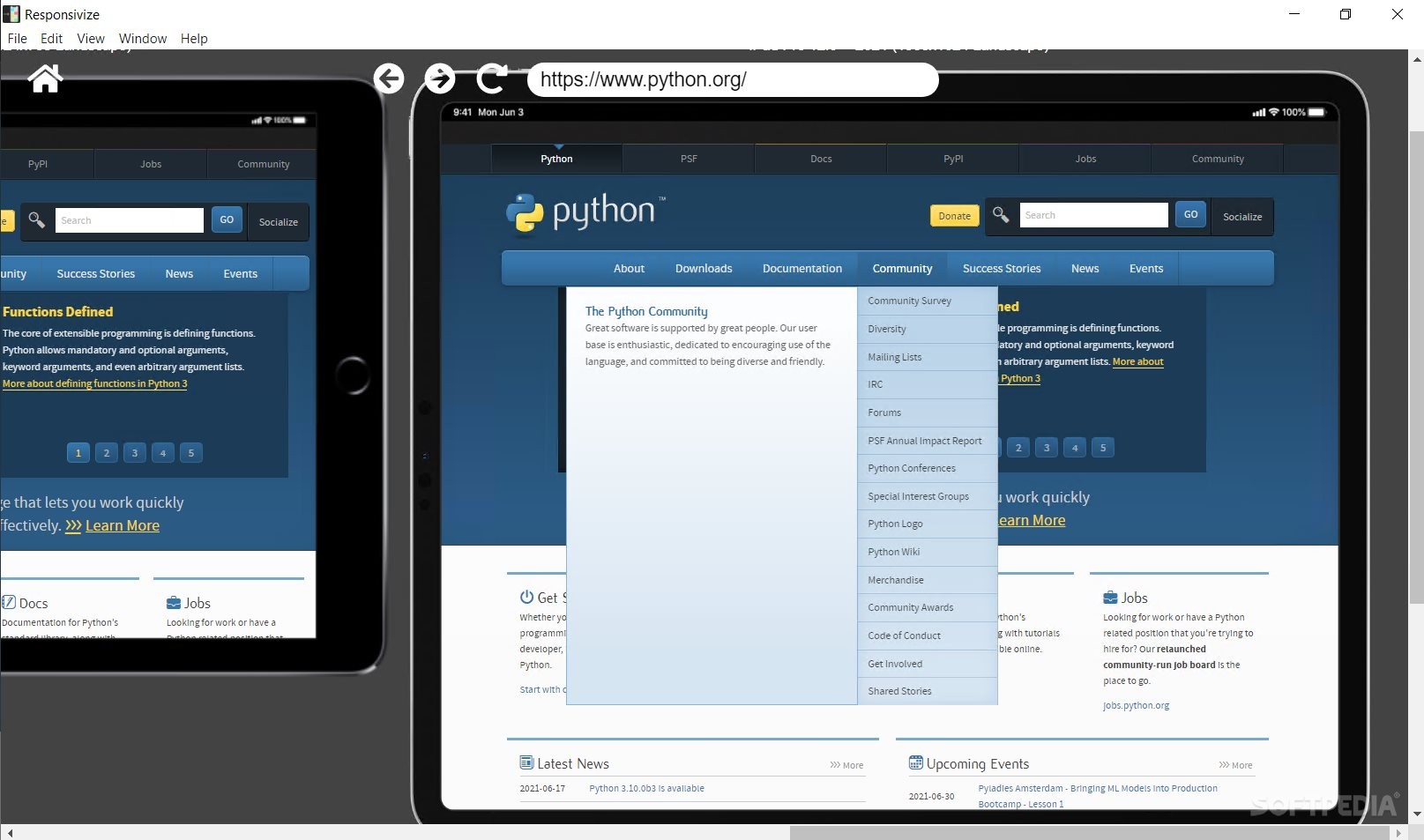
However, Responsivize manages to overcome some of the limitations imposed by the technology that is being used, Electron. How? Well, the tool works well, it is simplistic yet efficient, and it has the flexibility of allowing users to navigate their website(s) inside the loaded screen types (e.g. mobile) and to interact independently with each device emulator.
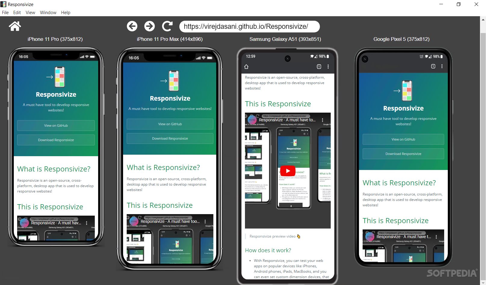
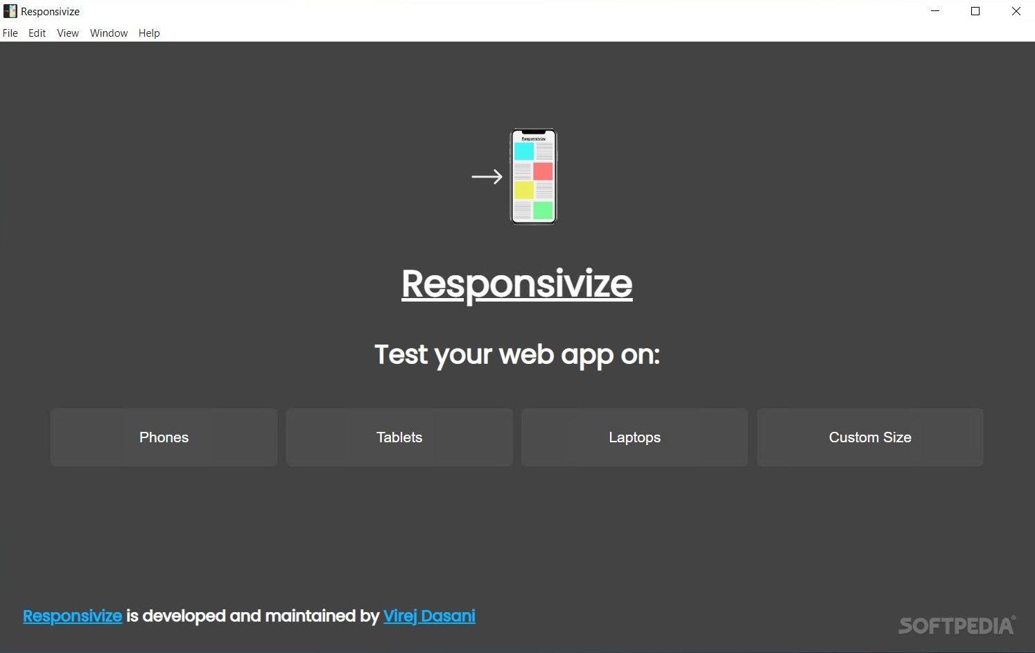
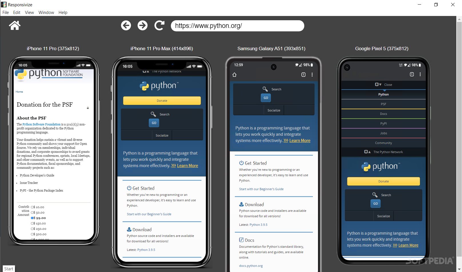
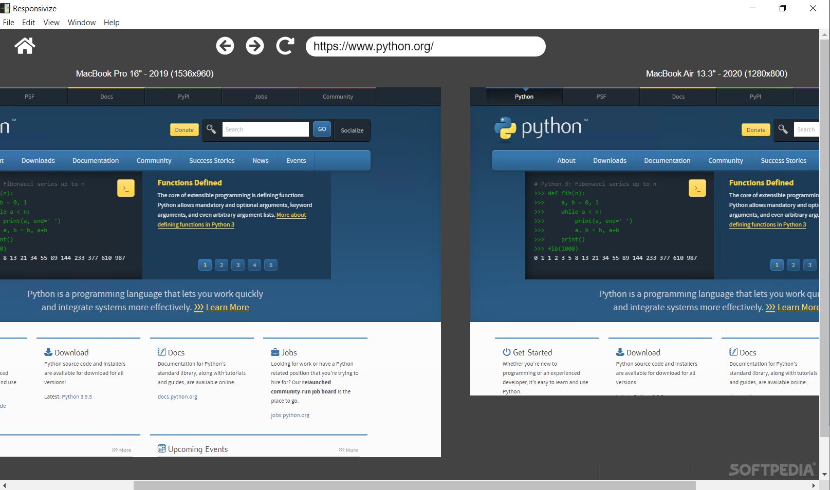
Responsivize is a simplistic program with a minimalistic approach to responsive testing. The application has four different options — 'Phones,' 'Tablets,' 'Laptops,' and 'Custom size.'
In each section, you have a search bar that allows you to search for the desired URL, and to display the content on the screen(s) that are available. For each device emulator type, you have available the screen sizes of modern devices, such as iPhone 11, Samsung Galaxy A51, Google, Pixel 5, iPad, MacBook, etc.
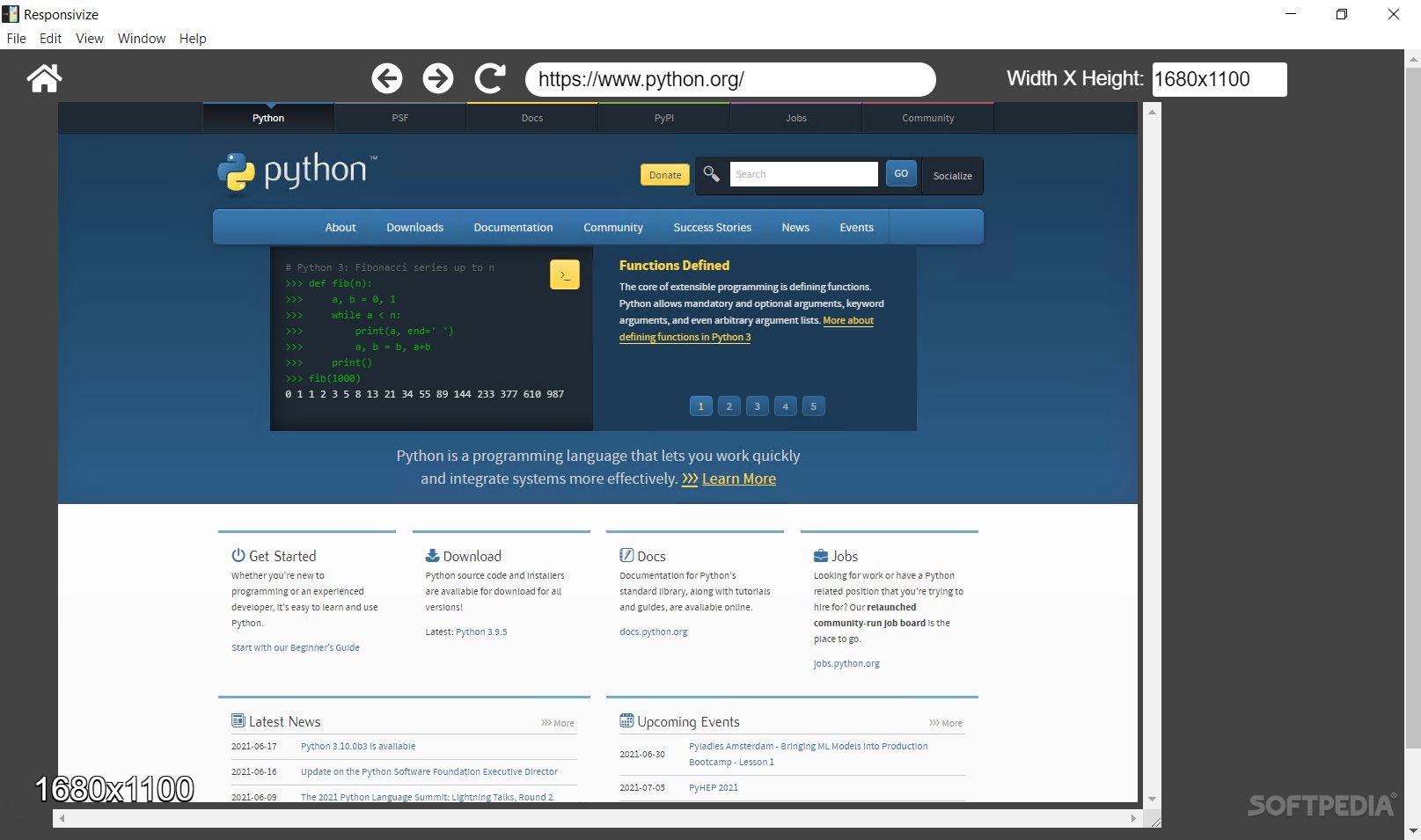
However, with the 'Custom size' option, you can recreate any desired screen size, and easily test your website's responsiveness against it.
Being still in its early stages, Responsivize is a surprisingly well-built program. The app's interface could be a bit more responsive when resizing the app's window, and the 'Custom size' functionality could be integrated within the first three categories (phones, tablets, and laptops).
The latter is a suggestion that aims at making it easier for users to add a new screen size if they don't find their desired format in the available options. Also, it could be useful to have the option of saving previously customized screen sizes (e.g. creating a new device profile), so you'd have them saved and available for future testing needs.
To conclude, although the app still leaves a place for improvements, it could be a great addition to a developer/designer's testing/development toolkit.
An open-source tool that is free and works well
The open-source community is growing rapidly, and, as a consequence, more and more tools and projects emerge daily. Responsivize is an open-source project which offers cross-platform applications that allow users to test the way their website designs performs on different screen sizes. For Windows, the app comes in two formats — with an installer and in the portable format.
Being an Electron application, it is expected that Responsivize has a sleek, good-looking GUI. Also, it is important to take into account that Electron applications run on 64-bit architectures only. Also, regarding the app's size (in the portable format), after unzipping the portable version, you end up with a pretty large file.
However, Responsivize manages to overcome some of the limitations imposed by the technology that is being used, Electron. How? Well, the tool works well, it is simplistic yet efficient, and it has the flexibility of allowing users to navigate their website(s) inside the loaded screen types (e.g. mobile) and to interact independently with each device emulator.
How does the menu look like and what to expect?
Responsivize is a simplistic program with a minimalistic approach to responsive testing. The application has four different options — 'Phones,' 'Tablets,' 'Laptops,' and 'Custom size.'
In each section, you have a search bar that allows you to search for the desired URL, and to display the content on the screen(s) that are available. For each device emulator type, you have available the screen sizes of modern devices, such as iPhone 11, Samsung Galaxy A51, Google, Pixel 5, iPad, MacBook, etc.
However, with the 'Custom size' option, you can recreate any desired screen size, and easily test your website's responsiveness against it.
Possible improvements?
Being still in its early stages, Responsivize is a surprisingly well-built program. The app's interface could be a bit more responsive when resizing the app's window, and the 'Custom size' functionality could be integrated within the first three categories (phones, tablets, and laptops).
The latter is a suggestion that aims at making it easier for users to add a new screen size if they don't find their desired format in the available options. Also, it could be useful to have the option of saving previously customized screen sizes (e.g. creating a new device profile), so you'd have them saved and available for future testing needs.
To conclude, although the app still leaves a place for improvements, it could be a great addition to a developer/designer's testing/development toolkit.
83.3 MB
Info
Update Date
Jun 28 2021
Version
2.0.0
License
MIT License
Created By
Virej Dasani
Related software Internet


